レスポンシブ投稿記事一覧
日別の投稿記事一覧
スマホサイトでよく崩れるアレ
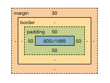
「スマホ画面の横幅375px」に対し、要素が600pxとか。
いろんな原因が考えられますが、たいていは画像が原因ですね。
今回は、mapのiframeが原因で、レイアウトが崩れています。
![](https://nakkan-base.blog/wp-content/uploads/2021/09/width01.png)
![](https://nakkan-base.blog/wp-content/uploads/2021/09/width02.png)
![](https://nakkan-base.blog/wp-content/uploads/2021/09/width03-1.png)
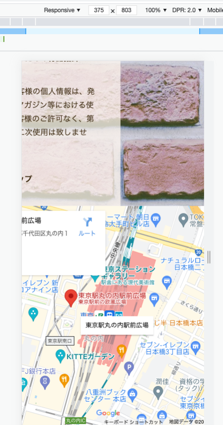
iframeを埋め込むと、そこに「width=”600″ height=”400″」とか指定してあるのでそこを触ることはできません。
で、どうするか。
iframe { width: 100%; }
これで解決しました。
![](https://nakkan-base.blog/wp-content/uploads/2021/09/width04.png)